Client: AT&T
Description: It’s worth.. WHAT?
Information: Promoting AT&T’s newest trade-in plan, we wanted to let people know that they might be surprised by the value of their old phones in this cheeky take on a classic show.
Discovery
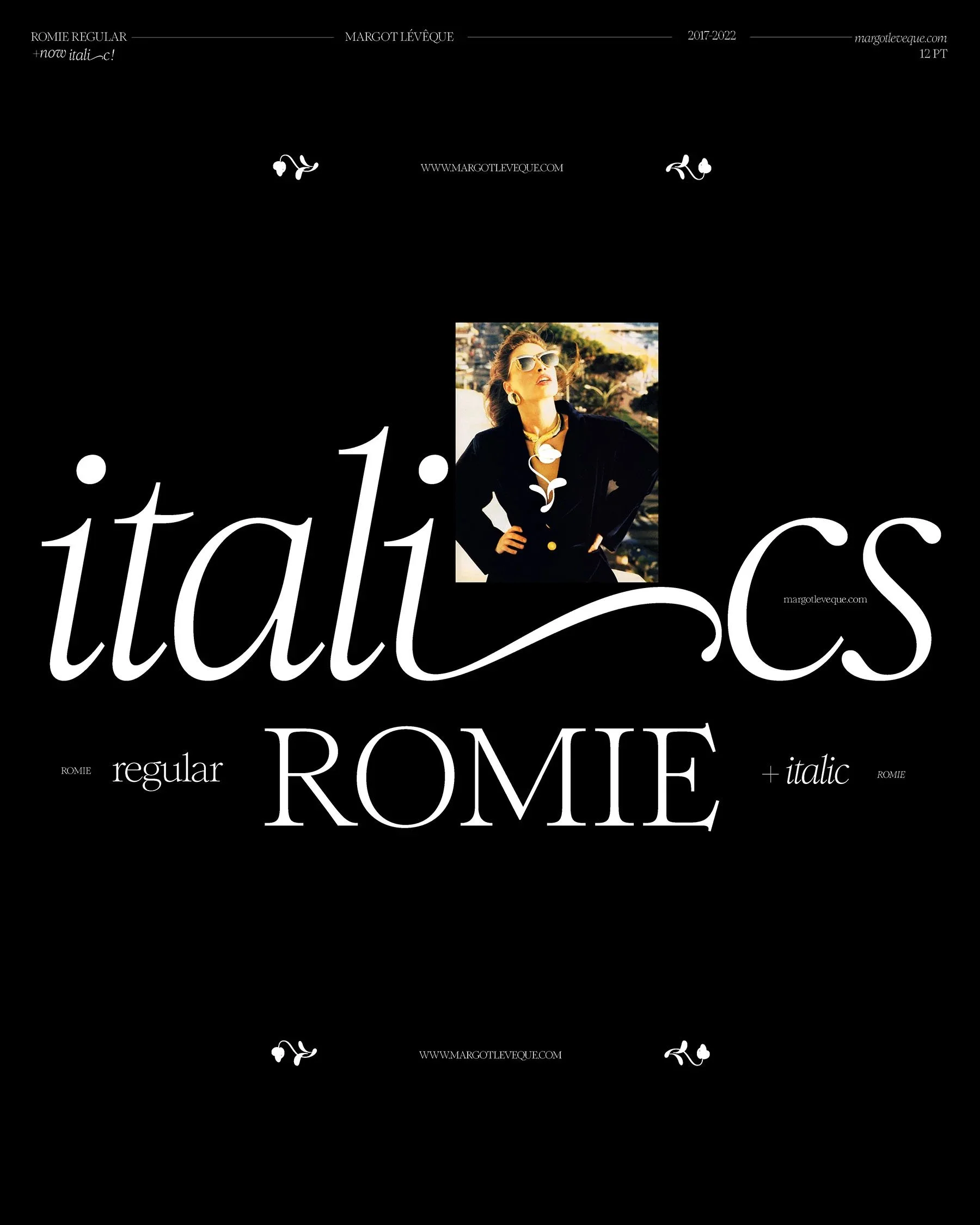
After being briefed in I learned the team wanted to reference the classic program Antiques Roadshow, specifically the UK version. The creative direction for our spot was fun, modern, and elegant. Knowing what the creative team was looking for I played around with several typefaces. All three are viable options but Romie Italic felt like the clear winner as it encapsulated the essence of the idea best.
Process
We knew we needed a monogram as well as the full written title of the spot, “Great Estimations” I presented several options in varying degrees of gold because we knew we wanted to play off the original lockup but didn’t want to use the same typeface.
Layout Options
From there I matched the set designers existing section banners seen below. I provided several type treatments as the set designer was looking for an elegant, art deco inspired antique feel.
FINAL
Extracting the variable flourishes on the italic lowercase t in our typeface I extended that off the stem and serifs of several letters to create an elegant flowing feel that the original logo possessed. I also tracked the letters in and gave them a 2px stroke so the body felt sturdy.
Once in post production, we decided to adjust the flourishes to create movement in both directions of the lockup. Our talented studio team then took this into 3D space. We tweaked the color and voilà, our finished product.


